Waste Less, Taste More. Recipes from your pantry to your plate.
iOS & Android Native App
UI/UX Case Study
April - May, 2024
Got time to take a deep dive?
This case study has been condensed to save you time.
Click below to view the more in-depth version on Behance.
Goal
To design the iOS and Android version of a recipe mobile app that helps users stay organised in the kitchen, in order to prevent household food waste.
Role
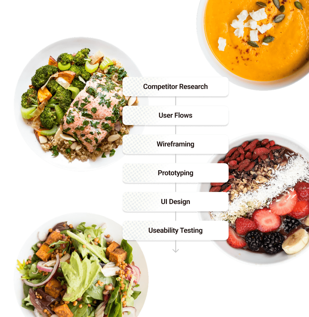
This project was a part of the UI Design course I took at CareerFoundry, and, therefore, I was the sole designer, taking on every aspect of the process.
The Purpose
Let’s tackle food waste
Are we buying too much and eating too little? I have a real problem with letting food go to waste and, judging by these stats, I’m not alone.
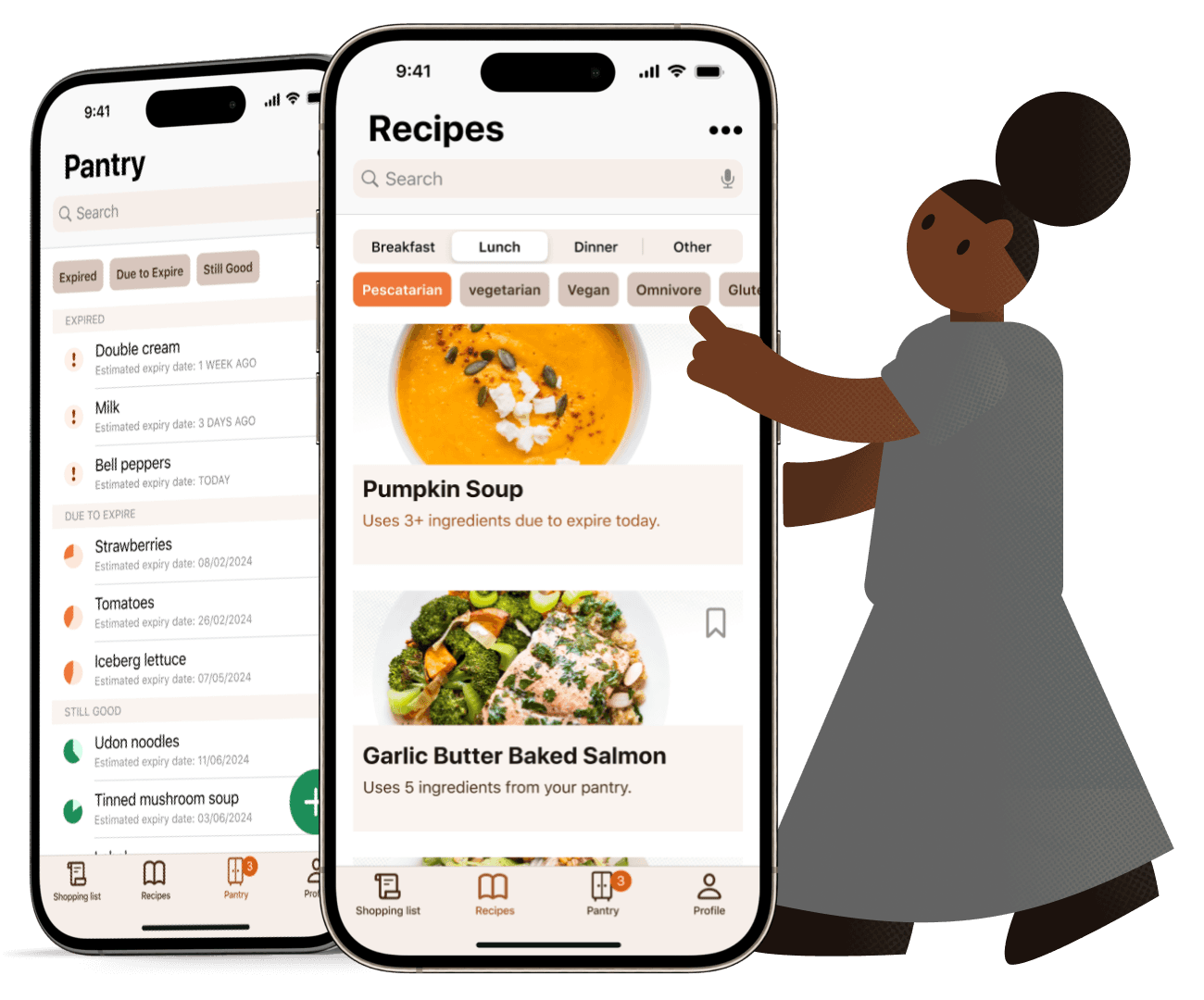
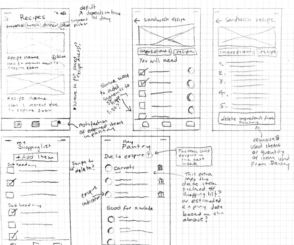
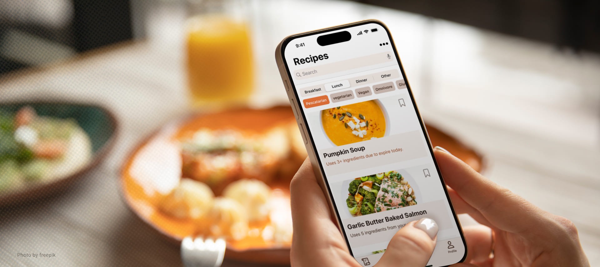
That’s why I wanted to create an app that not only provides cooking recipes, but suggests which ones to cook based on what food is due to expire first.
The Objective
What’s the solution?
Zero Waste Kitchen aims to help users keep track of what’s coming in and out of their kitchen.
Unlike it’s competitors, this app has expiry date tracking, an integrated shopping list, and suggested recipes based on recent purchases and ingredient expiry dates.
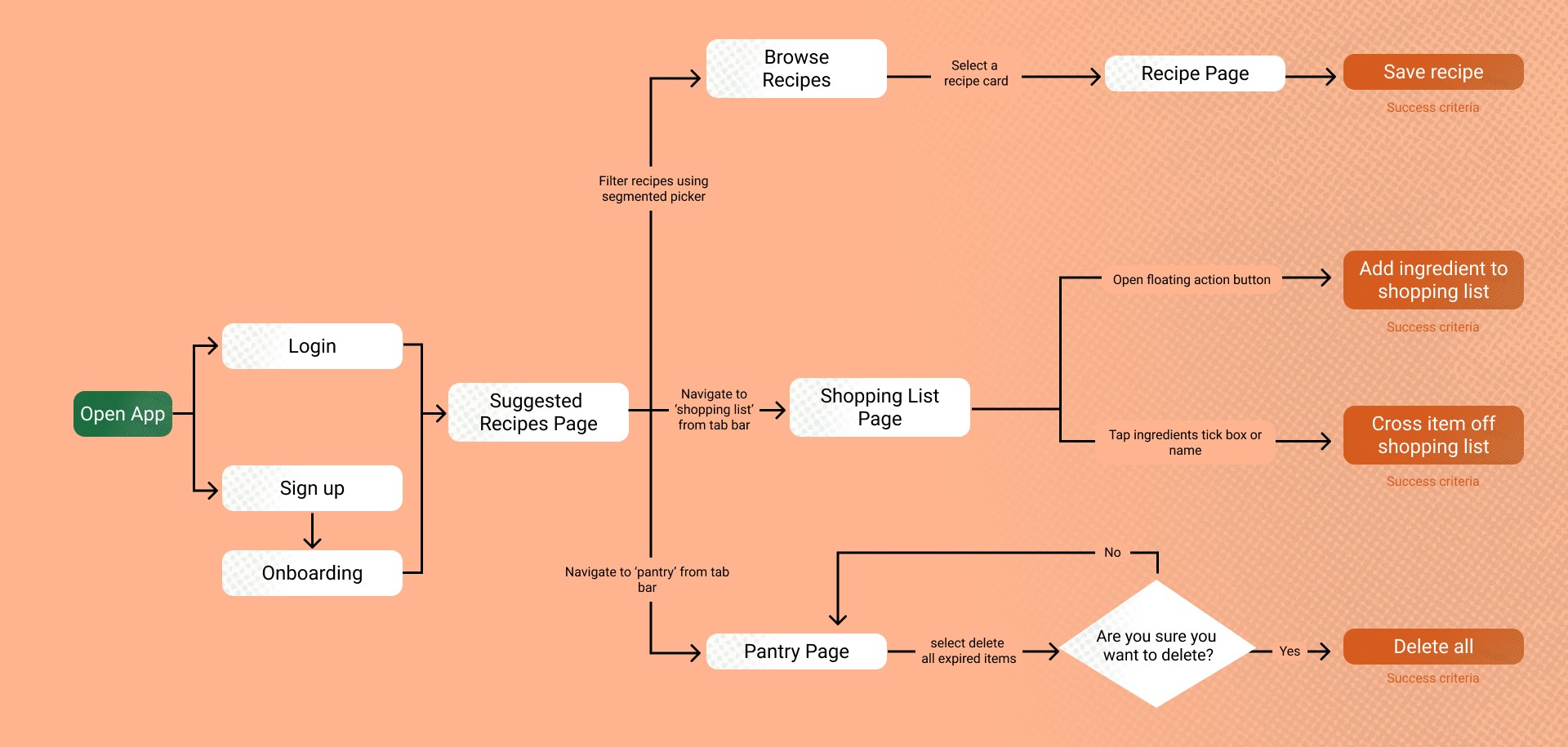
User Flow Diagram
Why Native & Not A Web App?
Shopping lists can still be accessed at supermarkets with poor connection.
Push notifications can be sent when fresh produce is about to expire.
Cognitive load reduced by following iOS and Material Design guidelines.
User Feedback & Testing
Participants’ main concerns were with the expiry date icons on the Pantry and Recipe pages.
They expressed issue with the expiry date icons:
confusing users
not being accessible
looking similar to material design’s progress indicators
“What info is the circle showing?”
“Love these circles but I am confused as to what info they represent?”
“Personally, it would be really useful to me if the Pantry section with the different food expiry dates was colour coded. I find it a lot easier to visualise like that than to judge the little bars. I guess a percentage would also work but I would prefer colours.”
Feedback Solution
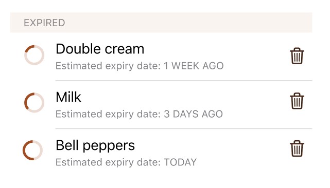
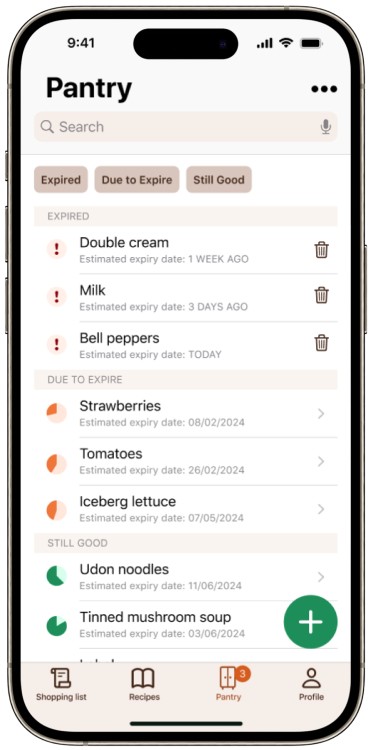
Icons revised with clarity of meaning, accessibility and brand consistency in mind. They are now colour coded, so time indication is a lot clearer. And the circle percentage bigger to be more legible to users with colour blindness.
Expired Icon Adjustments
It didn’t make sense for the expired icon to still have “time on the clock” if already expired. So, an exclamation point icon was used instead to help expired food to stand out and inform the user to take action.
High-Fidelity Wireframes
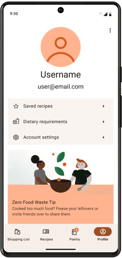
Profile
A section of the app where users can view their saved recipes, adjust their dietary requirements and, amend their account settings.
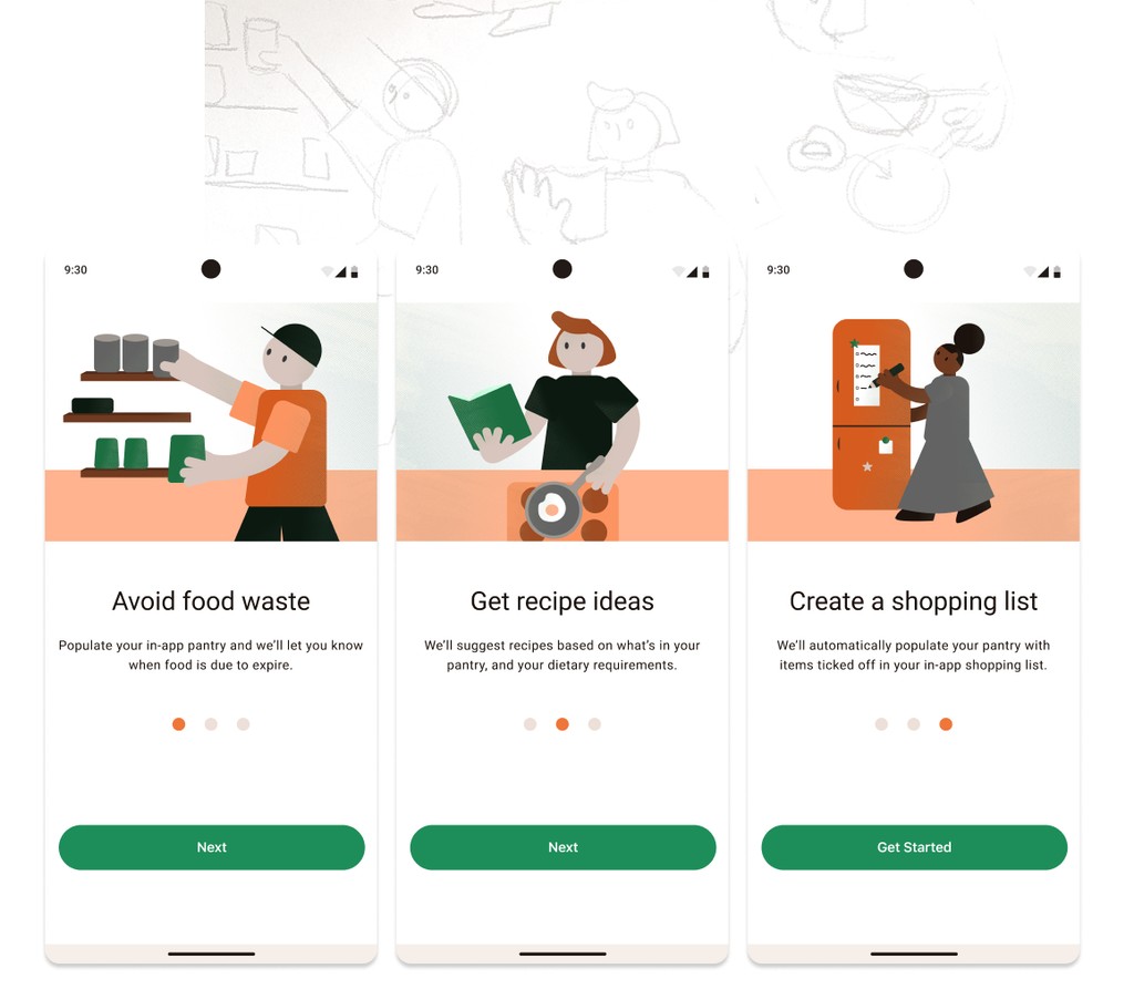
Sign up & onboarding
The onboarding screens increase product learnability, so the user can jump right in.
Recipes
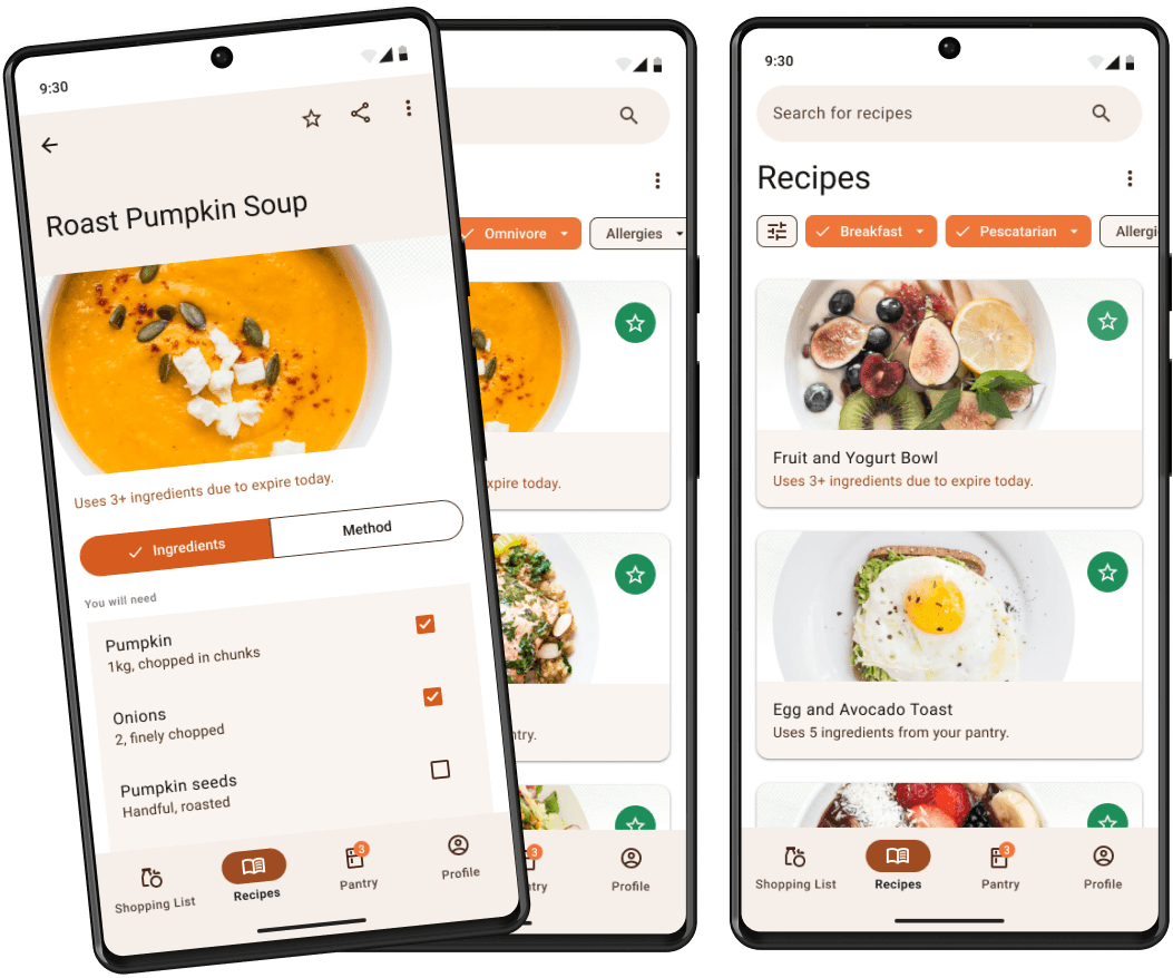
Recipes suggested to users based on their recent purchases, when items are due to expire & previously saved recipes.
Shopping List
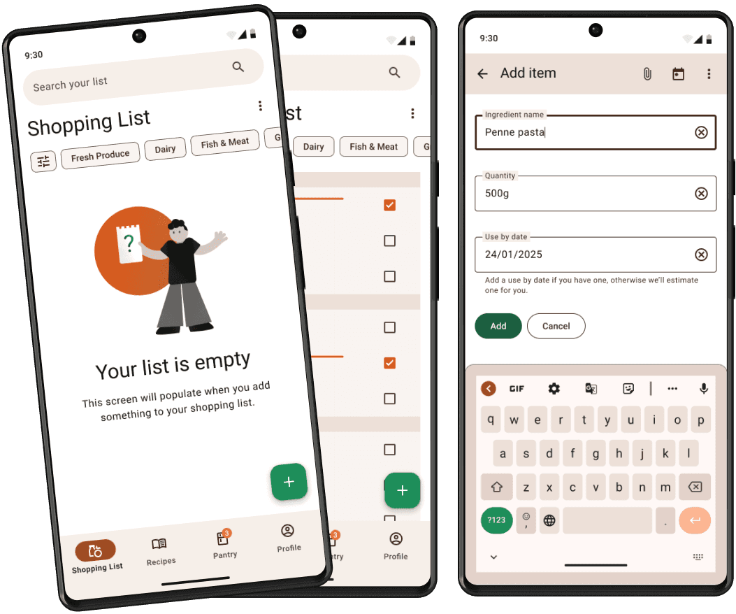
Before the shopping list is populated, the user is presented an empty slate screen.
Pantry
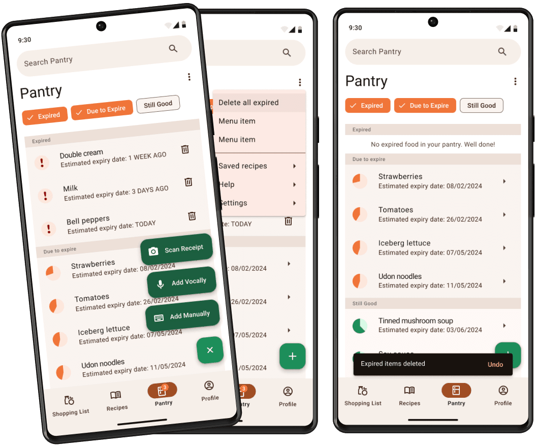
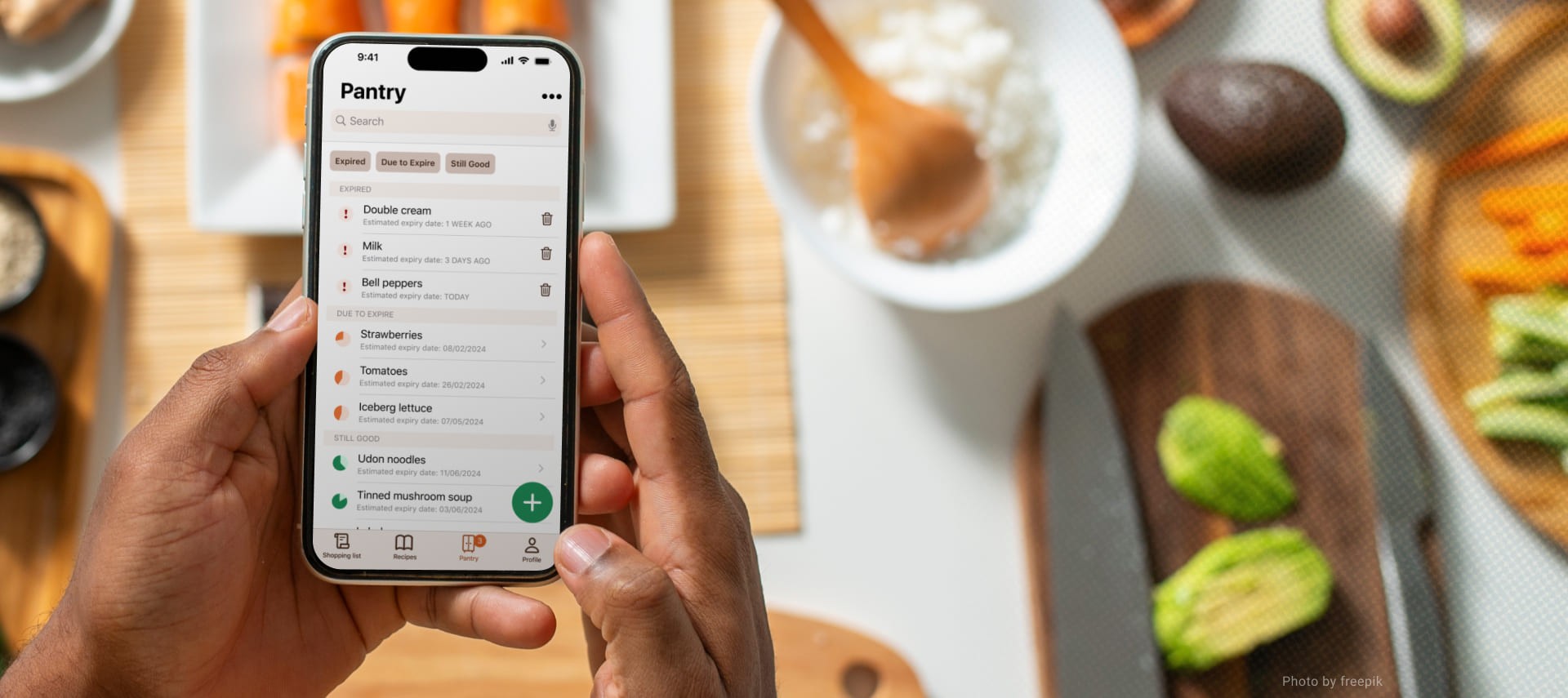
The user can be notified when something is due to expire or has expired, to help reduce their food waste. They can also search their pantry to see if they have an item before adding it to the shopping list.
Project Retrospective
What went well?
The user testing really helped me to see issues that I had overlooked, and to get my app to a place where I’m a lot more happy with it.
I also think taking my time during the wireframing stage helped me stick to iOS and material guidelines without rushing into styling and prototyping.
What Would I Change?
I think a dashboard/ homepage could improve the app. Somewhere the user would land after logging in, that gives an overview of the whole app.
This could include sections that show one or two suggested recipes, what items are about to expire and shopping list suggestions, all on one screen.
Future Iterations
Explore what the screens for scanning receipts and vocal list population look like.
Potential to make a version of the app compatible with Smart Fridges.
